Skip to content

Understanding Vue.js's <Suspense> and Async Components

Understanding Vue.js's <Suspense> and Async Components

In this blog post, we will delve into how <Suspense> and async components work, their benefits, and practical implementation strategies to make your Vue.js applications more efficient and user-friendly. Without further ado, let’s get started!

Suspense

Let's kick off by explaining what Suspense components are. They are a new component that helps manage how your application handles components that need to await for some async resource to resolve, like fetching data from a server, waiting for images to load, or any other task that might take some time to complete before they can be properly rendered. Imagine you're building a web page that needs to load data from a server, and you have 2 components that fetch the data you need as they will show different things. Typically, you might see a loading spinner or a skeleton while the data is being fetched. Suspense components make it easier to handle these scenarios. Instead of manually managing loading states and error messages for each component that needs to fetch data, Suspense components let you wrap all these components together. Inside this wrapper, you can define:

  1. What to show while the data is loading (like a loading spinner).
  2. The actual content that should be displayed once the data is successfully fetched.

This way, Vue Suspense simplifies the process of handling asynchronous operations (like data fetching) and improves the user (and the developer) experience by providing a more seamless and integrated way to show loading states and handle errors.

There are two types of async dependencies that <Suspense> can wait on:

  • Components with an async setup() hook. This includes components using <script setup> with top-level await expressions. Note: These can only be used within a <Suspense> component.
  • Async Components.

Async components

Vue's asynchronous components are like a smart loading system for your web app. Imagine your app as a big puzzle. Normally, you'd put together all the pieces at once, which can take time. But what if some pieces aren't needed right away? Asynchronous components help with this.

Here's how they work:

  • Load Only What's Needed: Just like only picking up puzzle pieces you need right now, asynchronous components let your app load only the parts that are immediately necessary. Other parts can be loaded later, as needed.
  • Faster Start: Your app starts up faster because it doesn't have to load everything at once. It's like quickly starting with the border of a puzzle and filling in the rest later.
  • Save Resources: It uses your web resources (like internet data) more wisely, only grabbing what’s essential when it's essential.

In short, asynchronous components make your app quicker to start and more efficient, improving the overall experience for your users.

Example:

<script setup>
import { defineAsyncComponent } from "vue";

const AsyncMasterSword = defineAsyncComponent(
  // the loader function
  loader: () => import("./components/MasterSword.vue"),
  // A component to use while the async component is loading
  loadingComponent: () => <template>Loading</template>,
  // Delay before showing the loading component. Default: 200ms.
  delay: 200,
  // A component to use if the load fails
  errorComponent: ErrorComponent,
  // The error component will be displayed if a timeout is
  // provided and exceeded. Default: Infinity.
  timeout: 3000

);
</script>

<template>
  <h1>Please, don't go alone! Take this:</h1>
  <AsyncMasterSword />
</template>

<style scoped></style>

Combining Async Components and Suspense

Let's explore how combining asynchronous components with Vue's Suspense feature can enhance your application. When asynchronous components are used with Vue's Suspense, they form a powerful combination. The key point is that async components are "suspensable" by default. This means they can be easily integrated with Suspense to improve how your app handles loading and rendering components.

When used together, you can do the following things:

  • Centralized Loading and Error Handling: With Suspense, you don't have to handle loading and error states individually for each async component. Instead, you can define a single loading indicator or error message within the Suspense component. This unified approach simplifies your code and ensures consistency across different parts of your app.
  • Flexible and Clean Code Structure: By combining async components with Suspense, your code becomes more organized and easier to maintain.

An asynchronous component has the flexibility to operate independently of Suspense's oversight. By setting suspensible: false in its options, the component takes charge of its own loading behavior. This means that instead of relying on Suspense to manage when it appears, the component itself dictates its loading state and presentation. This option is particularly useful for components that have specific loading logic or visuals they need to maintain, separate from the broader Suspense-driven loading strategy in the application. In practice, this combo allows you to create a user interface that feels responsive and cohesive. Users see a well-timed loading indicator while the necessary components are being fetched, and if something goes wrong, a single, well-crafted error message is displayed. It's like ensuring that the entire puzzle is either revealed in its completed form or not at all rather than showing disjointed parts at different times.

How it works

When a component inside the <Suspense> boundary is waiting for something asynchronous, <Suspense> shows fallback content. This fallback content can be anything you choose, such as a loading spinner or a message indicating that data is being loaded.

Example Usage

Let’s use a simple example: Suspence example screenshot

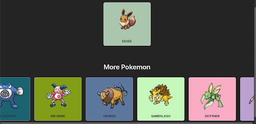
In the visual example provided, imagine we have two Vue components: one showcasing a selected Pokémon, Eevee, and a carousel showcasing a variety of other Pokémon. Both components are designed to fetch data asynchronously.

Without <Suspense>, while the data is being fetched, we would typically see two separate loading indicators: one for the Eevee Pokemon that is selected and another for the carousel. This can make the page look disjointed and be a less-than-ideal user experience.

loading indicator

We could display a single, cohesive loading indicator by wrapping both components inside a <Suspense> boundary. This unified loading state would persist until all the data for both components—the single Pokémon display and the carousel—has been fetched and is ready to be rendered.

Here's how you might structure the code for such a scenario:

<script setup>
import Pokedex from "./components/Pokedex.vue";
</script>

<template>
  <h1>Pokedex</h1>
  <Suspense>
    <!-- Default render - will render when ready -->
    <Pokedex />
    <!--  loading state  -->
    <template #fallback>
      <div>Loading...</div>
    </template>
  </Suspense>
</template>

// Pokedex component:

<script setup>
import GetRandomPokemon from "./GetRandomPokemon.vue";
import { defineAsyncComponent } from "vue";
const AsyncPokemonCarousel = defineAsyncComponent(
  () => import("./PokemonCarousel.vue"),
);
</script>

<template>
  <div class="container">
    <GetRandomPokemon :pokemon-name="'eevee'" />
    <AsyncPokemonCarousel />
  </div>
</template>

<style scoped>
.container {
  display: flex;
  flex-direction: column;
  align-items: center;
  margin-top: 2rem;
  gap: 5rem;
}
</style>

Here, <Pokedex> is the component that's performing asynchronous operations. While loading, the text 'Loading...' is displayed to the user.

loading indicator

Great! But what about when things don't go as planned and an error occurs? Currently, Vue's <Suspense> doesn't directly handle errors within its boundary. However, there's a neat workaround. You can use the onErrorCaptured() hook in the parent component of <Suspense> to catch and manage errors. Here's how it works:

<script setup>
import GetRandomPokemon from "./GetRandomPokemon.vue";
import { defineAsyncComponent, onErrorCaptured, ref } from "vue";
const AsyncPokemonCarousel = defineAsyncComponent(
  () => import("./PokemonCarousel.vue"),
);

const errorMessage = ref(null);
// capture error!
onErrorCaptured((error) => {
  console.error("Error captured in Pokedex.vue", error);
  errorMessage.value = error.message;
// stop error from propagating
  return false;
});
</script>

<template>
  <div class="container">
    <!-- Display the error message if it exists -->
    <div v-if="errorMessage" class="error-message">{{ errorMessage }}</div>
    <GetRandomPokemon :pokemon-name="'zelda'" />
    <AsyncPokemonCarousel />
  </div>
</template>

<style scoped>
.container {
  display: flex;
  flex-direction: column;
  align-items: center;
  margin-top: 2rem;
  gap: 5rem;
}
</style>

If we run this code, and let’s say that we had an error selecting our Pokemon, this is how it is going to display to the user:

error message

The error message is specifically tied to the component where the issue occurred, ensuring that it's the only part of your application that shows an error notification. Meanwhile, the rest of your components will continue to operate and display as intended, maintaining the overall user experience without widespread disruption. This targeted error handling keeps the application's functionality intact while indicating where the problem lies.

Conclusion

<Suspense> stands out as a formidable feature in Vue.js, transforming the management of asynchronous operations into a more streamlined and user-centric process. It not only elevates the user experience by ensuring smoother interactions during data loading phases but also enhances code maintainability and application performance. I hope you found this blog post enlightening and that it adds value to your Vue.js projects. As always, happy coding and continue to explore the vast possibilities Vue.js offers to make your applications more efficient and engaging!

This Dot is a consultancy dedicated to guiding companies through their modernization and digital transformation journeys. Specializing in replatforming, modernizing, and launching new initiatives, we stand out by taking true ownership of your engineering projects.

We love helping teams with projects that have missed their deadlines or helping keep your strategic digital initiatives on course. Check out our case studies and our clients that trust us with their engineering.

You might also like

The HTML Dialog Element: Enhancing Accessibility and Ease of Use cover image

The HTML Dialog Element: Enhancing Accessibility and Ease of Use

The HTML Dialog Element: Enhancing Accessibility and Ease of Use Dialogs are a common component added to applications, whether on the web or in native applications. Traditionally there has not been a standard way of implementing these on the web, resulting in many ad-hoc implementations that don’t act consistently across different web applications. Often, commonly expected features are missing from dialogs due to the complexity of implementing them. However, web browsers now offer a standard dialog element. Why use the dialog element? The native dialog element streamlines the implementation of dialogs, modals, and other kinds of non-modal dialogs. It does this by implementing many of the features needed by dialogs for you that are already baked into the browser. This is helpful as it reduces the burden on the developer when making their applications accessible by ensuring that user expectations concerning interaction are met, and it can also potentially simplify the implementation of dialogs in general. Basic usage Adding a dialog using the new tag can be achieved with just a few lines of code. ` However, adding the dialog alone won’t do anything to the page. It will show up only once you call the .showModal() method against it. ` Then if you want to close it you can call the .close() method on the dialog, or press the escape key to close it, just like most other modals work. Also, note how a backdrop appears that darkens the rest of the page and prevents you from interacting with it. Neat! Accessibility and focus management Correctly handling focus is important when making your web applications accessible to all users. Typically you have to move the current focus to the active dialog when showing them, but with the dialog element that’s done for you. By default, the focus will be set on the first focusable element in the dialog. You can optionally change which element receives focus first by setting the autofocus attribute on the element you want the focus to start on, as seen in the previous example where that attribute was added to the close element. Using the .showModal() method to open the dialog also implicitly adds the dialog ARIA role to the dialog element. This helps screen readers understand that a modal has appeared and the screen so it can act accordingly. Adding forms to dialogs Forms can also be added to dialogs, and there’s even a special method value for them. If you add a element with the method set to dialog then the form will have some different behaviors that differ from the standard get and post form methods. First off, no external HTTP request will be made with this new method. What will happen instead is that when the form gets submitted, the returnValue property on the form element will be set to the value of the submit button in the form. So given this example form: ` The form element with the example-form id will have its returnValue set to Submit. In addition to that, the dialog will close immediately after the submit event is done being handled, though not before automatic form validation is done. If this fails then the invalid event will be emitted. You may have already noticed one caveat to all of this. You might not want the form to close automatically when the submit handler is done running. If you perform an asynchronous request with an API or server you may want to wait for a response and show any errors that occur before dismissing the dialog. In this case, you can call event.preventDefault() in the submit event listener like so: ` Once your desired response comes back from the server, you can close it manually by using the .close() method on the dialog. Enhancing the backdrop The backdrop behind the dialog is a mostly translucent gray background by default. However, that backdrop is fully customizable using the ::backdrop pseudo-element. With it, you can set a background-color to any value you want, including gradients, images, etc. You may also want to make clicking the backdrop dismiss the modal, as this is a commonly implemented feature of them. By default, the &lt;dialog> element doesn’t do this for us. There are a couple of changes that we can make to the dialog to get this working. First, an event listener is needed so that we know when the user clicks away from the dialog. ` Alone this event listener looks strange. It appears to dismiss the dialog whenever the dialog is clicked, not the backdrop. That’s the opposite of what we want to do. Unfortunately, you cannot listen for a click event on the backdrop as it is considered to be part of the dialog itself. Adding this event listener by itself will effectively make clicking anywhere on the page dismiss the dialog. To correct for this we need to wrap the contents of the dialog content with another element that will effectively mask the dialog and receive the click instead. A simple element can do! ` Even this isn’t perfect though as the contents of the div may have elements with margins in them that will push the div down, resulting in clicks close to the edges of the dialog to dismiss it. This can be resolved by adding a couple of styles the the wrapping div that will make the margin stay contained within the wrapper element. The dialog element itself also has some default padding that will exacerbate this issue. ` The wrapping div can be made into an inline-block element to contain the margin, and by moving the padding from the parent dialog to the wrapper, clicks made in the padded portions of the dialog will now interact with the wrapper element instead ensuring it won’t be dismissed. Conclusion Using the dialog element offers significant advantages for creating dialogs and modals by simplifying implementation with reasonable default behavior, enhancing accessibility for users that need assistive technologies such as screen readers by using automatic ARIA role assignment, tailored support for form elements, and flexible styling options....

Introduction to Zod for Data Validation cover image

Introduction to Zod for Data Validation

As web developers, we're often working with data from external sources like APIs we don't control or user inputs submitted to our backends. We can't always rely on this data to take the form we expect, and we can encounter unexpected errors when it deviates from expectations. But with the Zod library, we can define what our data ought to look like and parse the incoming data against those defined schemas. This lets us work with that data confidently, or to quickly throw an error when it isn't correct. Why use Zod? TypeScript is great for letting us define the shape of our data in our code. It helps us write more correct code the first time around by warning us if we are doing something we shouldn't. But TypeScript can't do everything for us. For example, we can define a variable as a string or a number, but we can't say "a string that starts with user_id_ and is 20 characters long" or "an integer between 1 and 5". There are limits to how much TypeScript can narrow down our data for us. Also, TypeScript is a tool for us developers. When we compile our code, our types are not available to the vanilla JavaScript. JavaScript can't validate that the data we actually use in our code matches what we thought we'd get when we wrote our TypeScript types unless you're willing to manually write code to perform those checks. This is where we can reach for a tool like Zod. With Zod, we can write data schemas. These schemas, in the simplest scenarios, look very much like TypeScript types. But we can do more with Zod than we can with TypeScript alone. Zod schemas let us create additional rules for data parsing and validation. A 20-character string that starts with user_id_? It's z.string().startsWith('user_id_').length(20). An integer between 1 and 5 inclusive? It's z.number().int().gte(1).lte(5). Zod's primitives give us many extra functions to be more specific about *exactly* what data we expect. Unlike TypeScript, Zod schemas aren't removed on compilation to JavaScript—we still have access to them! If our app receives some data, we can verify that it matches the expected shape by passing it to your Zod schema's parse function. You'll either get back your data in exactly the shape you defined in your schema, or Zod will give you an error to tell you what was wrong. Zod schemas aren't a replacement for TypeScript; rather, they are an excellent complement. Once we've defined our Zod schema, it's simple to derive a TypeScript type from it and to use that type as we normally would. But when we really need to be sure our data conforms to the schema, we can always parse the data with our schema for that extra confidence. Defining Data Schemas Zod schemas are the variables that define our expectations for the shape of our data, validate those expectations, and transform the data if necessary to match our desired shape. It's easy to start with simple schemas, and to add complexity as required. Zod provides different functions that represent data structures and related validation options, which can be combined to create larger schemas. In many cases, you'll probably be building a schema for a data object with properties of some primitive type. For example, here's a schema that would validate a JavaScript object representing an order for a pizza: ` Zod provides a number of primitives for defining schemas that line up with JavaScript primitives: string, number, bigint, boolean, date, symbol, undefined, and null. It also includes primitives void, any, unknown, and never for additional typing information. In addition to basic primitives, Zod can define object, array, and other native data structure schemas, as well as schemas for data structures not natively part of JavaScript like tuple and enum. The documentation contains considerable detail on the available data structures and how to use them. Parsing and Validating Data with Schemas With Zod schemas, you're not only telling your program what data should look like; you're also creating the tools to easily verify that the incoming data matches the schema definitions. This is where Zod really shines, as it greatly simplifies the process of validating data like user inputs or third party API responses. Let's say you're writing a website form to register new users. At a minimum, you'll need to make sure the new user's email address is a valid email address. For a password, we'll ask for something at least 8 characters long and including one letter, one number, and one special character. (Yes, this is not really the best way to write strong passwords; but for the sake of showing off how Zod works, we're going with it.) We'll also ask the user to confirm their password by typing it twice. First, let's create a Zod schema to model these inputs: ` So far, this schema is pretty basic. It's only making sure that whatever the user types as an email is an email, and it's checking that the password is at least 8 characters long. But it is *not* checking if password and confirmPassword match, nor checking for the complexity requirements. Let's enhance our schema to fix that! ` By adding refine with a custom validation function, we have been able to verify that the passwords match. If they don't, parsing will give us an error to let us know that the data was invalid. We can also chain refine functions to add checks for our password complexity rules: ` Here we've chained multiple refine functions. You could alternatively use superRefine, which gives you even more fine grained control. Now that we've built out our schema and added refinements for extra validation, we can parse some user inputs. Let's see two test cases: one that's bound to fail, and one that will succeed. ` There are two main ways we can use our schema to validate our data: parse and safeParse. The main difference is that parse will throw an error if validation fails, while safeParse will return an object with a success property of either true or false, and either a data property with your parsed data or an error property with the details of a ZodError explaining why the parsing failed. In the case of our example data, userInput2 will parse just fine and return the data for you to use. But userInput1 will create a ZodError listing all of the ways it has failed validation. ` ` We can use these error messages to communicate to the user how they need to fix their form inputs if validation fails. Each error in the list describes the validation failure and gives us a human readable message to go with it. You'll notice that the validation errors for checking for a valid email and for checking password length have a lot of details, but we've got three items at the end of the error list that don't really tell us anything useful: just a custom error of Invalid input. The first is from our refine checking if the passwords match, and the second two are from our refine functions checking for password complexity (numbers and special characters). Let's modify our refine functions so that these errors are useful! We'll add our own error parameters to customize the message we get back and the path to the data that failed validation. ` Now, our error messages from failures in refine are informative! You can figure out which form fields aren't validating from the path, and then display the messages next to form fields to let the user know how to remedy the error. ` By giving our refine checks a custom path and message, we can make better use of the returned errors. In this case, we can highlight specific problem form fields for the user and give them the message about what is wrong. Integrating with TypeScript Integrating Zod with TypeScript is very easy. Using z.infer&lt;typeof YourSchema> will allow you to avoid writing extra TypeScript types that merely reflect the intent of your Zod schemas. You can create a type from any Zod schema like so: ` Using a TypeScript type derived from a Zod schema does *not* give you any extra level of data validation at the type level beyond what TypeScript is capable of. If you create a type from z.string.min(3).max(20), the TypeScript type will still just be string. And when compiled to JavaScript, even that will be gone! That's why you still need to use parse/safeParse on incoming data to validate it before proceeding as if it really does match your requirements. A common pattern with inferring types from Zod schemas is to use the same name for both. Because the schema is a variable, there's no name conflict if the type uses the same name. However, I find that this can lead to confusing situations when trying to import one or the other—my personal preference is to name the Zod schema with Schema at the end to make it clear which is which. Conclusion Zod is an excellent tool for easily and confidently asserting that the data you're working with is exactly the sort of data you were expecting. It gives us the ability to assert at runtime that we've got what we wanted, and allows us to then craft strategies to handle what happens if that data is wrong. Combined with the ability to infer TypeScript types from Zod schemas, it lets us write and run more reliable code with greater confidence....

How to build an AI assistant with OpenAI, Vercel AI SDK, and Ollama with Next.js cover image

How to build an AI assistant with OpenAI, Vercel AI SDK, and Ollama with Next.js

In today’s blog post, we’ll build an AI Assistant using three different AI models: Whisper and TTS from OpenAI and Llama 3.1 from Meta. While exploring AI, I wanted to try different things and create an AI assistant that works by voice. This curiosity led me to combine OpenAI’s Whisper and TTS models with Meta’s Llama 3.1 to build a voice-activated assistant. Here’s how these models will work together: * First, we’ll send our audio to the Whisper model, which will convert it from speech to text. * Next, we’ll pass that text to the Llama 3.1 model. Llama will understand the text and generate a response. * Finally, we’ll take Llama’s response and send it to the TTS model, turning the text back into speech. We’ll then stream that audio back to the client. Let’s dive in and start building this excellent AI Assistant! Getting started We will use different tools to build our assistant. To build our client side, we will use Next.js. However, you could choose whichever framework you prefer. To use our OpenAI models, we will use their TypeScript / JavaScript SDK. To use this API, we require the following environmental variable: OPENAI_API_KEY— To get this key, we need to log in to the OpenAI dashboard and find the API keys section. Here, we can generate a new key. Awesome. Now, to use our Llama 3.1 model, we will use Ollama and the Vercel AI SDK, utilizing a provider called ollama-ai-provider. Ollama will allow us to download our preferred model (we could even use a different one, like Phi) and run it locally. The Vercel SDK will facilitate its use in our Next.js project. To use Ollama, we just need to download it and choose our preferred model. For this blog post, we are going to select Llama 3.1. After installing Ollama, we can verify if it is working by opening our terminal and writing the following command: Notice that I wrote “llama3.1” because that’s my chosen model, but you should use the one you downloaded. Kicking things off It's time to kick things off by setting up our Next.js app. Let's start with this command: ` After running the command, you’ll see a few prompts to set the app's details. Let's go step by step: * Name your app. * Enable app router. The other steps are optional and entirely up to you. In my case, I also chose to use TypeScript and Tailwind CSS. Now that’s done, let’s go into our project and install the dependencies that we need to run our models: ` Building our client logic Now, our goal is to record our voice, send it to the backend, and then receive a voice response from it. To record our audio, we need to use client-side functions, which means we need to use client components. In our case, we don’t want to transform our whole page to use client capabilities and have the whole tree in the client bundle; instead, we would prefer to use Server components and import our client components to progressively enhance our application. So, let’s create a separate component that will handle the client-side logic. Inside our app folder, let's create a components folder, and here, we will be creating our component: ` Let’s go ahead and initialize our component. I went ahead and added a button with some styles in it: ` And then import it into our Page Server component: ` Now, if we run our app, we should see the following: Awesome! Now, our button doesn’t do anything, but our goal is to record our audio and send it to someplace; for that, let us create a hook that will contain our logic: ` We will use two APIs to record our voice: navigator and MediaRecorder. The navigator API will give us information about the user’s media devices like the user media audio, and the MediaRecorder will help us record the audio from it. This is how they’re going to play out together: ` Let’s explain this code step by step. First, we create two new states. The first one is for keeping track of when we are recording, and the second one stores the instance of our MediaRecorder. ` Then, we’ll create our first method, startRecording. Here, we are going to have the logic to start recording our audio. We first check if the user has media devices available thanks to the navigator API that gives us information about the browser environment of our user: If we don’t have media devices to record our audio, we just return. If they do, then let us create a stream using their audio media device. ` Finally, we go ahead and create an instance of a MediaRecorder to record this audio: ` Then we need a method to stop our recording, which will be our stopRecording. Here, we will just stop our recording in case a media recorder exists. ` We are recording our audio, but we are not storing it anywhere. Let’s add a new useEffect and ref to accomplish this. We would need a new ref, and this is where our chunks of audio data will be stored. ` In our useEffect we are going to do two main things: store those chunks in our ref, and when it stops, we are going to create a new Blob of type audio/mp3: ` It is time to wire this hook with our AudioRecorder component: ` Let’s go to the other side of the coin, the backend! Setting up our Server side We want to use our models on the server to keep things safe and run faster. Let’s create a new route and add a handler for it using route handlers from Next.js. In our App folder, let’s make an “Api” folder with the following route in it: We want to use our models on the server to keep things safe and run faster. Let’s create a new route and add a handler for it using route handlers from Next.js. In our App folder, let’s make an “Api” folder with the following route in it: ` Our route is called ‘chat’. In the route.ts file, we’ll set up our handler. Let’s start by setting up our OpenAI SDK. ` In this route, we’ll send the audio from the front end as a base64 string. Then, we’ll receive it and turn it into a Buffer object. ` It’s time to use our first model. We want to turn this audio into text and use OpenAI’s Whisper Speech-To-Text model. Whisper needs an audio file to create the text. Since we have a Buffer instead of a file, we’ll use their ‘toFile’ method to convert our audio Buffer into an audio file like this: ` Notice that we specified “mp3”. This is one of the many extensions that the Whisper model can use. You can see the full list of supported extensions here: https://platform.openai.com/docs/api-reference/audio/createTranscription#audio-createtranscription-file Now that our file is ready, let’s pass it to Whisper! Using our OpenAI instance, this is how we will invoke our model: ` That’s it! Now, we can move on to the next step: using Llama 3.1 to interpret this text and give us an answer. We’ll use two methods for this. First, we’ll use ‘ollama’ from the ‘ollama-ai-provider’ package, which lets us use this model with our locally running Ollama. Then, we’ll use ‘generateText’ from the Vercel AI SDK to generate the text. Side note: To make our Ollama run locally, we need to write the following command in the terminal: ` ` Finally, we have our last model: TTS from OpenAI. We want to reply to our user with audio, so this model will be really helpful. It will turn our text into speech: ` The TTS model will turn our response into an audio file. We want to stream this audio back to the user like this: ` And that’s all the whole backend code! Now, back to the frontend to finish wiring everything up. Putting It All Together In our useRecordVoice.tsx hook, let's create a new method that will call our API endpoint. This method will also take the response back and play to the user the audio that we are streaming from the backend. ` Great! Now that we’re getting our streamed response, we need to handle it and play the audio back to the user. We’ll use the AudioContext API for this. This API allows us to store the audio, decode it and play it to the user once it’s ready: ` And that's it! Now the user should hear the audio response on their device. To wrap things up, let's make our app a bit nicer by adding a little loading indicator: ` Conclusion In this blog post, we saw how combining multiple AI models can help us achieve our goals. We learned to run AI models like Llama 3.1 locally and use them in our Next.js app. We also discovered how to send audio to these models and stream back a response, playing the audio back to the user. This is just one of many ways you can use AI—the possibilities are endless. AI models are amazing tools that let us create things that were once hard to achieve with such quality. Thanks for reading; now, it’s your turn to build something amazing with AI! You can find the complete demo on GitHub: AI Assistant with Whisper TTS and Ollama using Next.js...

Internationalization in Next.js with next-intl cover image

Internationalization in Next.js with next-intl

Internationalization in Next.js with next-intl Internationalization (i18n) is essential for providing a multi-language experience for global applications. next-intl integrates well with Next.js’ App Router, handling i18n routing, locale detection, and dynamic configuration. This guide will walk you through setting up i18n in Next.js using next-intl for URL-based routing, user-specific settings, and domain-based locale routing. Getting Started First, create a Next.js app with the App Router and install next-intl: ` Next, configure next-intl in the next.config.ts file to provide a request-specific i18n configuration for Server Components: ` Without i18n Routing Setting up an app without i18n routing integration can be advantageous in scenarios where you want to provide a locale to next-intl based on user-specific settings or when your app supports only a single language. This approach offers the simplest way to begin using next-intl, as it requires no changes to your app’s structure, making it an ideal choice for straightforward implementations. ` Here’s a quick explanation of each file's role: * translations/: Stores different translations per language (e.g., en.json for English, es.json for Spanish). Organize this as needed, e.g., translations/en/common.json. * request.ts: Manages locale-based configuration scoped to each request. Setup request.ts for Request-Specific Configuration Since we will be using features from next-intl in Server Components, we need to add the following configuration in i18n/request.ts: ` Here, we define a static locale and use that to determine which translation file to import. The imported JSON data is stored in the message variable, and is returned together with the locale so that we can access them from various components in the application. Using Translation in RootLayout Inside RootLayout, we use getLocale() to retrieve the static locale and set the document language for SEO and pass translations to NextIntlClientProvider: ` Note that NextIntlClientProvider automatically inherits configuration from i18n/request.ts here, but messages must be explicitly passed. Now you can use translations and other functionality from next-intl in your components: ` In case of async components, you can use the awaitable getTranslations function instead: ` And with that, you have i18n configured and working on your application! \ Now, let’s take it a step further by introducing routing. \ With i18n Routing To set up i18n routing, we need a file structure that separates each language configuration and translation file. Below is the recommended structure: ` We updated the earlier structure to include some files that we require for routing: * routing.ts: Sets up locales, default language, and routing, shared between middleware and navigation. * middleware.ts: Handles URL rewrites and locale negotiation. * app/[locale]/: Creates dynamic routes for each locale like /en/about and /es/about. Define Routing Configuration in i18n/routing.ts The routing.ts file configures supported locales and the default locale, which is referenced by middleware.ts and other navigation functions: ` This configuration lets Next.js handle URL paths like /about, with locale management managed by next-intl. Update request.ts for Request-Specific Configuration We need to update the getRequestConfig function from the above implementation in i18n/request.ts. ` Here, request.ts ensures that each request loads the correct translation files based on the user’s locale or falls back to the default. Setup Middleware for Locale Matching The middleware.ts file matches the locale based on the request: ` Middleware handles locale matches and redirects to localized paths like /en or /es. Updating the RootLayout file Inside RootLayout, we use the locale from params (matched by middleware) instead of calling getLocale() ` The locale we get from the params was matched in the middleware.ts file and we use that here to set the document language for SEO purposes. Additionally, we used this file to pass configuration from i18n/request.ts to Client Components through NextIntlClientProvider. Note: When using the above setup with i18n routing, next-intl will currently opt into dynamic rendering when APIs like useTranslations are used in Server Components. next-intl provides a temporary API that can be used to enable static rendering. Static Rendering for i18n Routes For apps with dynamic routes, use generateStaticParams to pass all possible locale values, allowing Next.js to render at build time: ` next-intl provides an API setRequestLocale that can be used to distribute the locale that is received via params in layouts and pages for usage in all Server Components that are rendered as part of the request. You need to call this function in every layout/page that you intend to enable static rendering for since Next.js can render layouts and pages independently. ` Note: Call setRequestLocale before invoking useTranslations or getMessages or any next-intl functions. Domain Routing For domain-specific locale support, use the domains setting to map domains to locales, such as us.example.com/en or ca.example.com/fr. ` This setup allows you to serve localized content based on domains. Read more on domain routing here. Conclusion Setting up internationalization in Next.js with next-intl provides a modular way to handle URL-based routing, user-defined locales, and domain-specific configurations. Whether you need URL-based routing or a straightforward single-locale setup, next-intl adapts to fit diverse i18n needs. With these tools, your app will be ready to deliver a seamless multi-language experience to users worldwide....

Let's innovate together!

We're ready to be your trusted technical partners in your digital innovation journey.

Whether it's modernization or custom software solutions, our team of experts can guide you through best practices and how to build scalable, performant software that lasts.

Prefer email? hi@thisdot.co