Skip to content

Creating Custom Scrollbars with React

This article was written over 18 months ago and may contain information that is out of date. Some content may be relevant but please refer to the relevant official documentation or available resources for the latest information.

Styling scrollbars is no simple task. The CSS available to style them is different across browsers, and not very featureful. If you want to make something extremely customized, you can't rely on the native scrollbars—you have to build your own out of DOM elements. This blog post shows you how to do just that using React and TypeScript. If you want to skip straight to the final functional demo, go here.

Structure of a Scrollbar

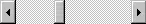
A scroll bar has two main components: a thumb (this piece you click and drag to scroll) and a track (the space within which the thumb moves). The size of the thumb usually gives a hint to how large the visible content is in relation to the total size of the content. That is to say, the smaller the thumb, the more content there is outside of the current view. Thumb position on the track tells you how much off-screen content there is in each scroll direction. Scrollbars sometimes also have buttons on the ends that you can click to scroll a set amount in a certain direction, though these aren't seen as often as they used to be. We'll be recreating both of these user interface elements with div elements.

Scrollbar

Hide Native Scrollbars

Before we create our custom scrollbars, we'll need to hide the native browser scrollbars to prevent interference. This is easily accomplished with a bit of CSS. We're also including overflow: auto, because we want to make sure that out content is still scrollable even if we can't see the native scrollbars.

.custom-scrollbars__content {
  overflow: auto;
  scrollbar-width: none;
  -ms-overflow-style: none;
}

.custom-scrollbars__content::-webkit-scrollbar {
  display: none;
}

Custom Scrollbar Functionality

Laying out Scrollbar Elements

The content we want to scroll and the scrollbar itself will go inside a wrapper div. That div will have two children: another div containing the content, and a div containing our scrollbar.

The scrollbar div will contain a button to scroll up, the elements of the thumb and track inside a wrapper div, and another button to scroll down. In the example below, they've been given classes (remember, we're using React, so we're using className) to help identify them.

<div className="custom-scrollbars__container">
  <div className="custom-scrollbars__content">
    {children}
  </div>
  <div className="custom-scrollbars__scrollbar">
    <button className="custom-scrollbars__button">⇑</button>
    <div className="custom-scrollbars__track-and-thumb">
      <div className="custom-scrollbars__track"></div>
      <div className="custom-scrollbars__thumb"></div>
    </div>
    <button className="custom-scrollbars__button">⇓</button>
  </div>
</div>

The track and thumb elements are siblings and will both be positioned absolutely with CSS. The top style of the thumb will be modified with JavaScript. It's better to have these two side-by-side and positioned absolutely, rather than have the thumb as a child of the track, because it prevents any ambiguity about whether you've clicked one or the other. If you click and drag the thumb, but drag so fast that your cursor is over the track when you realease it, it's possible, when nesting them, to accidentally trigger a click event on the track. That would could weird scrolling bugs. Keeping them as siblings prevents that.

.custom-scrollbars__track-and-thumb {
  display: block;
  height: 100%;  /* must have some height */
  position: relative;
  width: 16px; /* must have some width */
}

/* The track is meant to fill the space it's given, so top and bottom are set to 0. */
.custom-scrollbars__track {
  bottom: 0;
  cursor: pointer;
  position: absolute;
  top: 0;
  width: 16px; /* must have some width */
}

/* No top or bottom set for the thumb. That will be controlled by JavaScript. */
.custom-scrollbars__thumb {
  position: absolute;
  width: 16px; /* must have some width */
}

Sizing the Thumb

Your content may change size from initial render, due to data fetch requests completing or for other reasons. The size of the thumb needs to be able to adjust to match whatever the current content's size is.

Because the content resizing won't necessarily result in the window resizing, we'll use a ResizeObserver to what for changes in just the content size.

We store references to the content element, the track, the thumb, and the resize observer with useRef. Our handleResize() function computes the ratio of visible content to total scrollable content (clientHeight / scrollHeight) of the content container, then multiplies it by the track's height to get a height for the thumb. We set a minimum of 20 pixels for the height in case the content is so long that the thumb would otherwise be too small to click. The thumb's height is finally stored in React state.

A useEffect sets an initial height, then creates a ResizeObserver to watch the size of the content, and trigger the handleResize() function again if it occurs.

import React, { useState, useEffect, useRef } from 'react';

const Scrollbar = ({
  children,
  className,
  ...props
}: React.ComponentPropsWithoutRef<'div'>) => {
  const contentRef = useRef<HTMLDivElement>(null);
  const scrollTrackRef = useRef<HTMLDivElement>(null);
  const scrollThumbRef = useRef<HTMLDivElement>(null);
  const observer = useRef<ResizeObserver | null>(null);
  const [thumbHeight, setThumbHeight] = useState(20);

  function handleResize(ref: HTMLDivElement, trackSize: number) {
    const { clientHeight, scrollHeight } = ref;
    setThumbHeight(Math.max((clientHeight / scrollHeight) * trackSize, 20));
  }

  // If the content and the scrollbar track exist, use a ResizeObserver to adjust height of thumb and listen for scroll event to move the thumb
  useEffect(() => {
    if (contentRef.current && scrollTrackRef.current) {
      const ref = contentRef.current;
      const {clientHeight: trackSize} = scrollTrackRef.current;
      observer.current = new ResizeObserver(() => {
        handleResize(ref, trackSize);
      });
      observer.current.observe(ref);
      return () => {
        observer.current?.unobserve(ref);
      };
    }
  }, []);

  return (
    <div className="custom-scrollbars__container">
      <div className="custom-scrollbars__content" ref={contentRef} {...props}>
        {children}
      </div>
      <div className="custom-scrollbars__scrollbar">
        <button className="custom-scrollbars__button">⇑</button>
        <div className="custom-scrollbars__track-and-thumb">
          <div className="custom-scrollbars__track"></div>
          <div
            className="custom-scrollbars__thumb"
            ref={scrollThumbRef}
            style={{
              height: `${thumbHeight}px`,
            }}
          ></div>
        </div>
        <button className="custom-scrollbars__button">⇓</button>
      </div>
    </div>
  );
};

export default Scrollbar;

Handle the Position of the Thumb

When we scroll, the thumb should move in proportion to our scrolling. We'll do this with a useCallback that is called on the scroll event. We take the proportion of how far the content has been scrolled (scrollTop) to the total scrollable area (scrollHeight), and multiply it by the track's height to get the new position of the top edge of the thumb. To make sure the thumb doesn't fly off the end of the track, we cap the top position to no more than the difference between the track's height and the thumb's height.

- import React, { useState, useEffect, useRef } from 'react';
+ import React, { useState, useEffect, useRef, useCallback } from 'react';
const handleThumbPosition = useCallback(() => {
  if (
    !contentRef.current ||
    !scrollTrackRef.current ||
    !scrollThumbRef.current
  ) {
    return;
  }
  const { scrollTop: contentTop, scrollHeight: contentHeight } =
    contentRef.current;
  const { clientHeight: trackHeight } = scrollTrackRef.current;
  let newTop = (+contentTop / +contentHeight) * trackHeight;
  newTop = Math.min(newTop, trackHeight - thumbHeight);
  const thumb = scrollThumbRef.current;
  thumb.style.top = `${newTop}px`;
}, []);
useEffect(() => {
  if (contentRef.current && scrollTrackRef.current) {
    const ref = contentRef.current;
    const {clientHeight: trackSize} = scrollTrackRef.current;
    observer.current = new ResizeObserver(() => {
      handleResize(ref, trackSize);
    });
    observer.current.observe(ref);
+   ref.addEventListener('scroll', handleThumbPosition);
    return () => {
      observer.current.unobserve(ref);
+     ref.removeEventListener('scroll', handleThumbPosition);
    };
  }
}, []);

Handle Clicking the Buttons

Wiring the up and down scroll buttons is very straightforward. We simply create a function that accepts a direction, and scrolls the content by a fixed amount in that direction. Keep in mind that in browsers, the y axis is positive going from top to bottom. That means scrolling down would mean a positive number of pixels, and up would be negative. Then we add this function to the onClick of our buttons.

function handleScrollButton(direction: 'up' | 'down') {
  const { current } = contentRef;
  if (current) {
    const scrollAmount = direction === 'down' ? 200 : -200;
    current.scrollBy({ top: scrollAmount, behavior: 'smooth' });
  }
}
<button
  className="custom-scrollbars__button"
+ onClick={() => handleScrollButton('up')}
>
  ⇑
</button>

...

<button
  className="custom-scrollbars__button"
+ onClick={() => handleScrollButton('down')}
>
  ⇓
</button>

Handle Clicking the Track

In most scrollbars, clicking on the scroll track will jump the thumb ahead in that direction. We'll once again useCallback to handle clicking on the track and updating the content's scroll position. The following snippet and comments walk through the steps of figuring out the new position for the content to scroll to.

const handleTrackClick = useCallback(
  (e) => {
    e.preventDefault();
    e.stopPropagation();
    const { current: trackCurrent } = scrollTrackRef;
    const { current: contentCurrent } = contentRef;
    if (trackCurrent && contentCurrent) {
      // First, figure out where we clicked
      const { clientY } = e;
      // Next, figure out the distance between the top of the track and the top of the viewport
      const target = e.target as HTMLDivElement;
      const rect = target.getBoundingClientRect();
      const trackTop = rect.top;
      // We want the middle of the thumb to jump to where we clicked, so we subtract half the thumb's height to offset the position
      const thumbOffset = -(thumbHeight / 2);
      // Find the ratio of the new position to the total content length using the thumb and track values...
      const clickRatio =
        (clientY - trackTop + thumbOffset) / trackCurrent.clientHeight;
      // ...so that you can compute where the content should scroll to.
      const scrollAmount = Math.floor(
        clickRatio * contentCurrent.scrollHeight
      );
      // And finally, scroll to the new position!
      contentCurrent.scrollTo({
        top: scrollAmount,
        behavior: 'smooth',
      });
    }
  },
  [thumbHeight]
);
<div
  className="custom-scrollbars__track"
  ref={scrollTrackRef}
+ onClick={handleTrackClick}
></div>

Handle Dragging the Thumb

At last, the hardest part: clicking and dragging the thumb to scroll. To do this, we write three functions to handle mousedown, mousemove, and mouseup events. We'll track whether or not we're actively dragging, where the mouse was when we started dragging, and where the scroll position of the content was where we started dragging with React state.

The handleThumbMouseup() function is simplest: it simply sets isDragging to false so we know we're not dragging the thumb anymore.

handleThumbMousedown does a bit more. In addition to setting isDragging to true, it records the mouse's y position, and the content's scrollTop when you click down, and sets them to scrollStartPosition and initialScrollTop respectively. We will use these values to calculate the new scrollTop for the content.

The handleThumbMousemove() function is the trickiest. First, we figure out how far the mouse now is (e.clientY) from where it was when we started (scrollStartPosition). This tells us the absolute number of pixels the thumb should have moved up or down. But we've decoupled the size of the content's container from the size of the scrollbar track, so pixels of thumb scrolling doesn't equal the number of pixels the content should scroll. (E.g., if the total content length is 7 times longer than the height of the track, then dragging the thumb by one pixel should scroll the content by 7 pixels.) To scale the value, we multiply it by the ratio of the content's height to the thumb's height. Finally, set calculate the new scrollTop and set it to the content. The thumb's position will take care of itself thanks to handleThumbPosition() being called by the scroll event listener on the content.

  const contentRef = useRef<HTMLDivElement>(null);
  const scrollTrackRef = useRef<HTMLDivElement>(null);
  const scrollThumbRef = useRef<HTMLDivElement>(null);
  const observer = useRef<ResizeObserver | null>(null);
  const [thumbHeight, setThumbHeight] = useState(20);
+ const [scrollStartPosition, setScrollStartPosition] = useState<number | null>(
    null
  );
+ const [initialScrollTop, setInitialScrollTop] = useState<number>(0);
+ const [isDragging, setIsDragging] = useState(false);
const handleThumbMousedown = useCallback((e) => {
  e.preventDefault();
  e.stopPropagation();
  setScrollStartPosition(e.clientY);
  if (contentRef.current) setInitialScrollTop(contentRef.current.scrollTop);
  setIsDragging(true);
}, []);

const handleThumbMouseup = useCallback(
  (e) => {
    e.preventDefault();
    e.stopPropagation();
    if (isDragging) {
      setIsDragging(false);
    }
  },
  [isDragging]
);

const handleThumbMousemove = useCallback(
  (e) => {
    e.preventDefault();
    e.stopPropagation();
    if (isDragging) {
      const {
        scrollHeight: contentScrollHeight,
        offsetHeight: contentOffsetHeight,
      } = contentRef.current;

      // Subtract the current mouse y position from where you started to get the pixel difference in mouse position. Multiply by ratio of visible content height to thumb height to scale up the difference for content scrolling.
      const deltaY =
        (e.clientY - scrollStartPosition) *
        (contentOffsetHeight / thumbHeight);
      const newScrollTop = Math.min(
        initialScrollTop + deltaY,
        contentScrollHeight - contentOffsetHeight
      );

      contentRef.current.scrollTop = newScrollTop;
    }
  },
  [isDragging, scrollStartPosition, thumbHeight]
);

// Listen for mouse events to handle scrolling by dragging the thumb
useEffect(() => {
  document.addEventListener('mousemove', handleThumbMousemove);
  document.addEventListener('mouseup', handleThumbMouseup);
  document.addEventListener('mouseleave', handleThumbMouseup);
  return () => {
    document.removeEventListener('mousemove', handleThumbMousemove);
    document.removeEventListener('mouseup', handleThumbMouseup);
    document.removeEventListener('mouseleave', handleThumbMouseup);
  };
}, [handleThumbMousemove, handleThumbMouseup]);
<div className="custom-scrollbars__track-and-thumb">
  <div
    className="custom-scrollbars__track"
    ref={scrollTrackRef}
    onClick={handleTrackClick}
+   style={{ cursor: isDragging ? 'grabbing' : 'pointer' }}
  ></div>
  <div
    className="custom-scrollbars__thumb"
    ref={scrollThumbRef}
+   onMouseDown={handleThumbMousedown}
    style={{
      height: `${thumbHeight}px`,
+     cursor: isDragging ? 'grabbing' : 'grab',
    }}
  ></div>
</div>

Full Code and Demo

That's it! You've now got a completely custom scrollbar in React and TypeScript using DOM elements instead of native scrollbars. You can customize these scrollbars with any kind of CSS you like!

You can see the full code here and play around with the demo.

This Dot is a consultancy dedicated to guiding companies through their modernization and digital transformation journeys. Specializing in replatforming, modernizing, and launching new initiatives, we stand out by taking true ownership of your engineering projects.

We love helping teams with projects that have missed their deadlines or helping keep your strategic digital initiatives on course. Check out our case studies and our clients that trust us with their engineering.

You might also like

CSS Container Queries, what are they? cover image

CSS Container Queries, what are they?

CSS Container queries, what are they? Intro Media queries have always been crucial to building web applications. They help make our apps more accessible and easier to use and ensure we reach most of our audience. Media queries have been essential in frontend development to create unique user interfaces. But now, there’s something new: Container queries. In this blog post, we’ll explore what Container queries are, how they differ from media queries, and why they’re so amazing. So, let’s get started! Refresh on Media queries Media queries have been available in browsers for a long time, but they didn’t become popular until around 2010 when mobile devices started to take off. Media queries let us add specific styles based on the type of device, like screens or printers. This is especially helpful for creating modern, responsive apps. A simple use of Media queries would be changing, for example, a paragraph's font size when the screen width is less than a specific number. ` In this simple example, when the browser’s viewport width is less or equal to 400px, the font size changes to 8px. Notice how straightforward the syntax is: we start with the keyword @media, followed by the type of device it should apply to. In this case, we use screen so it doesn’t affect users who print the page—if you don’t add anything, then it falls back to the default, which is “all” including both print and screen. Then we specify a media feature, in this case, the width. Container queries Container queries are similar to Media queries. Their main function is to apply styles under certain conditions. The difference is that instead of listening to the viewport of the browser, it listens to a container size. Let’s see this example: In the above layout, we have a layout with a sidebar and three cards as the content. Using Media queries we could listen to the viewport width and change the layout depending on a specific width. Like so: ` That’s acceptable, but it requires us to constantly monitor the layout. For example, if we added another sidebar on the right (really weird, but let’s imagine that this is a typical case), our layout would become more condensed: We would need to change our media queries and adjust their range in this situation. Wouldn’t it be better to check the card container’s width and update its styles based on that? That way, we wouldn’t need to worry about if the layout changes, and that’s precisely what container queries are made for! First, to define the container we are going to listen to, we are going to add a new property to our styles: ` The .container class is the one in which our cards reside. By adding the property `container-type, ' we now define this class as a container we want to listen to. We said inline-size as the value to query based on the inline dimensions of the container because we just want to listen to the element's width. The value of container-type will depend on your use case. If you want to listen to both width and height, then size will be a better fit for you. You can also have normal as your container-type value, which means the element won’t act as a query container at all. This is handy if you need to revert to the default behavior. Next, to define our query, we use the new @container CSS at-rule: ` Notice that it is really similar to how we define our Media queries. Now, if we look at the same screen, we will see the following: This is very powerful because we can now style each component with its own rules without changing the rules based on the layout changes. The @container will affect all the defined containers in the scope; we might not want that. We can define the name of our container to specify that we only want to listen to that in specific: ` We can also have a shorthand to define our container and its name: ` Container query length units Container query lengths are similar to the viewport-percentage length units like vh or vw units, but instead of being relative to the viewport, they are to the dimensions of the query container. We have different units, each relative to different dimensions of the container: - cqw: 1% of a query container's width - cqh: 1% of a query container's height - cqi: 1% of a query container's inline size - cqb: 1% of a query container's block size - cqmin: The smaller value of either cqi or cqb - cqmax: The larger value of either cqi or cqb In our example, we could use them to define the font size of our cards: ` Using these units alone isn’t recommended because they’re percentage-based and can have a value we don’t want. Instead, it’s better to use a dynamic range. Using the max function, we can set 2 values and always pick the highest one. Conclusion Container queries bring a fresh and powerful approach to web design but are not meant to replace Media queries. I think their real power shines when used together. Media queries often require constant adjustments as your layout evolves. Container queries, however, let you style individual components based on their dimensions, making the designs more flexible and easier to manage. Adding a new component or rearranging elements won’t force us to rewrite our media queries. Instead, each component handles its styling, leading to cleaner and more organized code. Please note that, as of writing this blog post, they aren’t compatible with all browsers yet. Take a look at this table from caniuse.com: A good fallback strategy for this, when hitting an unsupported browser would be the use of the @support rule, which allows you to apply styles only if the browser supports the CSS feature. For example: ` Ensure your media queries are good enough to keep everything responsive and user-friendly when the condition is unmet. Thank you for reading! Enjoy the extra flexibility that container queries bring to your web designs. Check out a live demo to see it in action. Happy styling!...

An example-based guide to CSS Cascade Layers cover image

An example-based guide to CSS Cascade Layers

CSS is actually good now! If you’ve been a web developer for a while, you’ll know this hasn’t always been the case. Over the past few years, a lot of really amazing features have been added that now support all the major browsers. Cascading and selector specificity have always been a pain point when writing stylesheets. CSS cascade layers is a new feature that provides us with a lot more power and flexibility for tackling this problem. We no longer need to resort to tricky specificity hacks or order-of-appearance magic. Cascade layers are really easy to get started with. I think the best way to understand how and when they are useful is by walking through some practical examples. In this post, we’ll cover: * What CSS cascade layers are and how they work * Real-world examples of using layers to manage style priorities * How Tailwind CSS leverages cascade layers What are CSS Cascade Layers? Imagine CSS cascade layers as drawers in a filing cabinet, each holding a set of styles. The drawer at the top represents the highest priority, so when you open the cabinet, you first access the styles in that drawer. If a style isn't found there, you move down to the next drawer until you find what you need. Traditionally, CSS styles cascade by specificity (i.e., more specific selectors win) and source order (styles declared later in the file override earlier ones). Cascade layers add a new, structured way to manage styles within a single origin—giving you control over which layer takes precedence without worrying about specificity. This is useful when you need to control the order of styles from different sources, like: * Resets (e.g., Normalize) * Third-party libraries (e.g., Tailwind CSS) * Themes and overrides You define cascade layers using the @layer rule, assigning styles to a specific layer. The order in which layers are defined determines their priority in the cascade. Styles in later layers override those in earlier layers, regardless of specificity or order within the file. Here’s a quick example: ` In this example, since the theme layer comes after base, it overrides the paragraph text color to dark blue—even though both declarations have the same specificity. How Do CSS Layers Work? Cascade layers allow you to assign rules to specific named layers, and then control the order of those layers. This means that: * Layers declared later take priority over earlier ones. * You don’t need to increase selector specificity to override styles from another layer—just place it in a higher-priority layer. * Styles outside of any layer will always take precedence over layered styles unless explicitly ordered. Let’s break it down with a more detailed example. ` In this example: * The unlayered audio rule takes precedence because it’s not part of the reset layer, even though the audio[controls] rule has higher specificity. * Without the cascade layers feature, specificity and order-of-appearance would normally decide the winner, but now, we have clear control by defining styles in or outside of a layer. Use Case: Overriding Styles with Layers Cascade layers become especially useful when working with frameworks and third-party libraries. Say you’re using a CSS framework that defines a keyframe animation, but you want to override it in your custom styles. Normally, you might have to rely on specificity or carefully place your custom rules at the end. With layers, this is simplified: ` There’s some new syntax in this example. Multiple layers can be defined at once. This declares up front the order of the layers. With the first line defined, we could even switch the order of the framework and custom layers to achieve the same result. Here, the custom layer comes after framework, so the translate animation takes precedence, no matter where these rules appear in the file. Cascade Layers in Tailwind CSS Tailwind CSS, a utility-first CSS framework, uses cascade layers starting with version 3. Tailwind organizes its layers in a way that gives you flexibility and control over third-party utilities, customizations, and overrides. In Tailwind, the framework styles are divided into distinct layers like base, components, and utilities. These layers can be reordered or combined with your custom layers. Here's an example: ` Tailwind assigns these layers in a way that utilities take precedence over components, and components override base styles. You can use Tailwind’s @layer directive to extend or override any of these layers with your custom rules. For example, if you want to add a custom button style that overrides Tailwind’s built-in btn component, you can do it like this: ` Practical Example: Layering Resets and Overrides Let’s say you’re building a design system with both Tailwind and your own custom styles. You want a reset layer, some basic framework styles, and custom overrides. ` In this setup: * The reset layer applies basic resets (like box-sizing). * The framework layer provides default styles for elements like paragraphs. * Your custom layer overrides the paragraph color to black. By controlling the layer order, you ensure that your custom styles override both the framework and reset layers, without messing with specificity. Conclusion CSS cascade layers are a powerful tool that helps you organize your styles in a way that’s scalable, easy to manage, and doesn’t rely on specificity hacks or the appearance order of rules. When used with frameworks like Tailwind CSS, you can create clean, structured styles that are easy to override and customize, giving you full control of your project’s styling hierarchy. It really shines for managing complex projects and integrating with third-party CSS libraries....

Upgrading from Astro 2 to Astro 4 cover image

Upgrading from Astro 2 to Astro 4

Upgrading from Astro 2 to Astro 4 Astro is building fast. Right on the heels of their version 3 launch on August 30th, Astro version 4 launched on December 6th, 2023. They've built so fast, that I didn't even have a chance to try 3 before 4 came out! But the short time between versions makes sense, because the two releases are very complementary. Many Astro features introduced in version 3 as experimental are made stable by version 4. If, like me, you're looking at a two-version upgrade, here's what you need to know about Astro 3 and 4 combined. View Transitions Astro makes it easy to include animated transitions between routes and components with the component. You can add it to the of specific pages, or to your site-wide to be enabled across the entire site. No configuration is required, but you'll probably still want to configure it. Adding between pages effectively turns your site into a single-page application, animating in and out content on route change rather than downloading a new statically generated HTML document. You can further customize how specific components animate in and out with the transition:animate property. If you don't want client side routing for a specific link, you can opt out for that link with the data-astro-reload property. Image Optimization The way Astro works with images has changed a lot from version 2. If you were using @astrojs/image, then updating how you handle images is probably going to be the most time-consuming part of your Astro migration. Astro's and components have had API changes, which will require you to make changes in your usage of them. You should definitely check out the full image migration guide in the Astro docs for all of the details. But some of the details you should be aware of: - @astrojs/image is out, astro:assets is in - You get image optimization when you import images inside /src. This can change your entire image src referencing strategy. Optimization only works for images imported from inside /src, so you might want to relocate images you've been keeping inside the /public directory. - Importing an image file no longer returns the path as a string, and an ImageMetadata object with src, width, height, and format properties. If you need the previous behavior, add ?url to the import path. - Markdown documents can reference image paths inside /src for automatic image optimization, no need to use in MDX nor reference the root relative paths of images in the /public directory. - The and components have changes to properties. For example, aspectRatio is no longer a valid property because it is inferred from the width and height of images. A new pictureAttributes property lets you do things like add a CSS style string. - You can use a helper image schema validator in your content collection schemas. Dev Toolbar The Dev Toolbar is a new local development feature to help developers work with their interactive islands and to integrate with other tools. The Inspect option highlights what parts of the page are interactive, and lets you examine them. You can view their props and even open them directly in your editor. Audit checks for accessibility issues, such as missing alt attributes in images. And the Menu lets you use specific integrations. Currently only Storyblok and spotlight are available, but you can expect more integrations in the future. And if you don't want to wait, you can also extend the Dev Toolbar yourself with their API. If you don't like the Dev Toolbar, you can turn it off in the CLI with astro preferences disable devToolbar. Conclusion Astro has added a lot of cool features in 2 major back-to-back releases, and you should absolutely consider upgrading if you're still on version 2. Be prepared to modify how you've handled images, but also get excited to play with view transitions!...

Integrating Playwright Tests into Your GitHub Workflow with Vercel cover image

Integrating Playwright Tests into Your GitHub Workflow with Vercel

Vercel previews offer a great way to test PRs for a project. They have a predefined environment and don’t require any additional setup work from the reviewer to test changes quickly. Many projects also use end-to-end tests with Playwright as part of the review process to ensure that no regressions slip uncaught. Usually, workflows configure Playwright to run against a project running on the GitHub action worker itself, maybe with dependencies in Docker containers as well, however, why bother setting that all up and configuring yet another environment for your app to run in when there’s a working preview right there? Not only that, the Vercel preview will be more similar to production as it’s running on the same infrastructure, allowing you to be more confident about the accuracy of your tests. In this article, I’ll show you how you can run Playwright against the Vercel preview associated with a PR. Setting up the Vercel Project To set up a project in Vercel, we first need to have a codebase. I’m going to use the Next.js starter, but you can use whatever you like. What technology stack you use for this project won’t matter, as integrating Playwright with it will be the same experience. You can create a Next.js project with the following command: ` If you’ve selected all of the defaults, you should be able to run npm run dev and navigate to the app at http://localhost:3000. Setting up Playwright We will set up Playwright the standard way and make a few small changes to the configuration and the example test so that they run against our site and not the Playwright site. Setup Playwright in our existing project by running the following command: ` Install all browsers when prompted, and for the workflow question, say no since the one we’re going to use will work differently than the default one. The default workflow doesn’t set up a development server by default, and if that is enabled, it will run on the GitHub action virtual machine instead of against our Vercel deployment. To make Playwright run tests against the Vercel deployment, we’ll need to define a baseUrl in playwright.config.ts and send an additional header called X-Vercel-Protection-Bypass where we'll pass the bypass secret that we generated earlier so that we don’t get blocked from making requests to the deployment. I’ll cover how to add this environment variable to GitHub later. ` Our GitHub workflow will set the DEPLOYMENT_URL environment variable automatically. Now, in tests/example.spec.ts let’s rewrite the tests to work against the Next.js starter that we generated earlier: ` This is similar to the default test provided by Playwright. The main difference is we’re loading pages relative to baseURL instead of Playwright’s website. With that done and your Next.js dev server running, you should be able to run npx playwright test and see 6 passing tests against your local server. Now that the boilerplate is handled let’s get to the interesting part. The Workflow There is a lot going on in the workflow that we’ll be using, so we’ll go through it step by step, starting from the top. At the top of the file, we name the workflow and specify when it will run. ` This workflow will run against new PRs against the default branch and whenever new commits are merged against it. If you only want the workflow to run against PRs, you can remove the push object. Be careful about running workflows against your main branch if the deployment associated with it in Vercel is the production deployment. Some tests might not be safe to run against production such as destructive tests or those that modify customer data. In our simple example, however, this isn’t something to worry about. Installing Playwright in the Virtual Machine Workflows have jobs associated with them, and each job has multiple steps. Our test job takes a few steps to set up our project and install Playwright. ` The actions/checkout@v4 step clones our code since it isn’t available straight out of the gate. After that, we install Node v22 with actions/setup-node@v4, which, at the time of writing this article, is the latest LTS available. The latest LTS version of Node should always work with Playwright. With the project cloned and Node installed, we can install dependencies now. We run npm ci to install packages using the versions specified in the lock file. After our JS dependencies are installed, we have to install dependencies for Playwright now. sudo npx playwright install-deps installs all system dependencies that Playwright needs to work using apt, which is the package manager used by Ubuntu. This command needs to be run as the administrative user since higher privilege is needed to install system packages. Playwright’s dependencies aren’t all available in npm because the browser engines are native code that has native library dependencies that aren’t in the registry. Vercel Preview URL and GitHub Action Await Vercel The next couple of steps is where the magic happens. We need two things to happen to run our tests against the deployment. First, we need the URL of the deployment we want to test. Second, we want to wait until the deployment is ready to go before we run our tests. We have written about this topic before on our blog if you want more information about this step, but we’ll reiterate some of that here. Thankfully, the community has created GitHub actions that allow us to do this called zentered/vercel-preview-url and UnlyEd/github-action-await-vercel. Here is how you can use these actions: ` There are a few things to take note of here. Firstly, some variables need to be set that will differ from project to project. vercel_app in the zentered/vercel-preview-url step needs to be set to the name of your project in Vercel that was created earlier. The other variable that you need is the VERCEL_TOKEN environment variable. You can get this by going to Vercel > Account Settings > Tokens and creating a token in the form that appears. For the scope, select the account that has your project. To put VERCEL_TOKEN into GitHub, navigate to your repo, go to Settings > Secrets and variables > Actions and add it to Repository secrets. We should also add VERCEL_AUTOMATION_BYPASS_SECRETl. In Vercel, go to your project then navigate to Settings > Deployment Protection > Protection Bypass for Automation. From here you can add the secret, copy it to your clipboard, and put it in your GitHub action environment variables just like we did with VERCEL_TOKEN. With the variables taken care of, let’s take a look at how these two steps work together. You will notice that the zentered/vercel-preview-url step has an ID set to vercel_preview_url. We need this so we can pass the URL we receive to the UnlyEd/github-action-await-vercel action, as it needs a URL to know which deployment to wait on. Running Playwright After the last steps we just added, our deployment should be ready to go, and we can run our tests! The following steps will run the Playwright tests against the deployment and save the results to GitHub: ` In the first step, where we run the tests, we pass in the environment variables needed by our Playwright configuration that’s stored in playwright.config.ts. DEPLOYMENT_URL uses the Vercel deployment URL we got in an earlier step, and VERCEL_AUTOMATION_BYPASS_SECRET gets passed the secret with the same name directly from the GitHub secret store. The second step uploads a report of how the tests did to GitHub, regardless of whether they’ve passed or failed. If you need to access these reports, you can find them in the GitHub action log. There will be a link in the last step that will allow you to download a zip file. Once this workflow is in the default branch, it should start working for all new PRs! It’s important to note that this won’t work for forked PRs unless they are explicitly approved, as that’s a potential security hazard that can lead to secrets being leaked. You can read more about this in the GitHub documentation. One Caveat There’s one caveat that is worth mentioning with this approach, which is latency. Since your application is being served by Vercel and not locally on the GitHub action instance itself, there will be longer round-trips to it. This could result in your tests taking longer to execute. How much latency there is can vary based on what region your runner ends up being hosted in and whether the pages you’re loading are served from the edge or not. Conclusion Running your Playwright tests against Vercel preview deployments provides a robust way of running your tests against new code in an environment that more closely aligns with production. Doing this also eliminates the need to create and maintain a 2nd test environment under which your project needs to work....

Let's innovate together!

We're ready to be your trusted technical partners in your digital innovation journey.

Whether it's modernization or custom software solutions, our team of experts can guide you through best practices and how to build scalable, performant software that lasts.

Prefer email? hi@thisdot.co